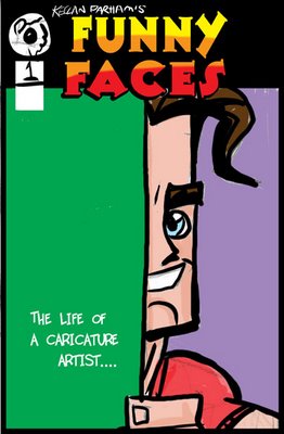
Anybody who knows me knows that comic books have always been my first love. When I was a kid, I dreamed of drawing Batman, Superman, all the big guns for Marvel and DC. As I got older, though, I decided I really only wanted to do my own characters. My good friend Ted Tucker and I even used to self publish our own book, Lunar Donut, many years ago so we could do that kind of thing. The book was doing pretty well, for a small press title, until real life set in, and we went back to our "day jobs" of drawing caricatures. But I'm still the biggest comic fan you're likely to meet.
For the past few years I've been very involved in the National Caricaturist Network, and have written and drawn an autobiographical strip (another love of mine) for their magazine, Exaggerated Features. the strip is entitled "Funny Faces". Sound familiar? After a few years of this, I have enough pages in the can that I'm thinking of printing up a comic of all my strips so far.
Here is a very loose mock up of a cover idea. Input appreciated. I'm about 85% sure I'm going to do this soon. Just a little concerned of being stuck with more boxes of comics in my garage...Lunar Donuts have been in there for years.....

5 comments:
Do it. Do it now. And have it ready for the NCN con. Yup.
I want a copy, NOW!
Yeah, if you decide to not publish it in paper, maybe you can publish it ONLINE. LifeofaCaricaturist.com maybe? Title "Life of a Caricaturist: Funny Faces." Or whatever.... Online would be cool, it seems to me.
Okay you said input welcomed.
At first I looked at it, and wasn't sure I liked that massive amount of green.
I think it would work much better if you were leaving space for more text there, like magazines do.....which might make for a cool feel.
But then looking at it more, I decided there were two cool ways to look at this.
One is I like the artsy balance of it all. Has a nice symmetry to it, then I realized that a lot of the time the subjects see caricature progress in this view. And it made perfect sense.
Either way, the art is fantastico, I'd buy one or five, because I've read some of these and they are funny strips...
Post a Comment